Add A Feature
Role
This was the first project that I worked on independently at Ironhack Miami UX/UI Bootcamp. We were given five days to complete our project using the double diamond design process.
Overview
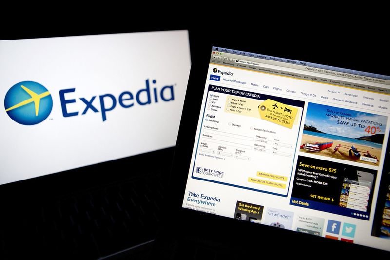
For this project, I needed to create a feature that would be beneficial to the user’s experience while using a particular application that is currently on the market. I decided to focus my project on Expedia. Expedia is a travel app that is used to book Flights, Hotels, Cruises, etc. It was founded in 1996. Some of their subsidies include Hotels.com, Orbitz, Trivago, Hotwire, Travelocity, HomeAway, Classic Vacations, and CarRentals.com
Tools
Figma, Miro
The Client
Founded in 1996 by Rich Barton
Headquarters: Bellevue, WA
Current CEO: Mark Okerstrom
Subsidiaries/Brands:
Hotels.com, Orbitz, Trivago, Hotwire, Travelocity, HomeAway, Egencia, Wotif Group, Classic Vacations, CarRentals.com
Operates in 70 countries
750 million monthly visitors
30 million reward members
550+ Airlines
750,000 properties
Revenue:
2020- 5.2 billion
2019-12.1 billion
46% of Expedia’s revenue is international
Discover
Lean UX Canvas
This is a living document used to formulate ideas about the overall outcome of the business. It is used to highlight the current problems from both the user and business side and the potential outcomes.
Competitive Feature Analysis
This tool was used to highlight and compare the current feature each travel app has in comparison to Expedia. As you can only two apps allow the option to compare pricing and not mall apps have the option to bundle packages.
Market Positioning Chart
Here is where we can see where the different competitors are currently in the market. From there we can create our blue ocean which is an area of opportunity for growth that also separates us from our competitors.
User Research
I was able to collect 35 surveys and conduct 3 user interviews in order to gain a better insight on what the users were experiencing while using the app.
Based on the information gathered:
Qualitative Data:
42.9% Use Expedia as their first choice when booking their vacations
31.4% Prefer to use travel apps to book their flights because of the cheaper rate
40% Use travel apps at least 3 times a year when booking vacations
37.2% Blame hidden fees and lack of features as their biggest frustration in travel apps
Qualitative Data:
“I don’t really feel confident that I’m getting a good deal.”
“It’s really just about the lowest price but I feel like it could be more organized.”
“This site is very overwhelming with the organization.It hurts my brain to even think about it, it makes me think okay, what are the actual details?”
Define
Affinity Map
After reviewing the results, I was able to uncover the most common trends that came up in the data. From there I was able to organize the information into different categories.
Value Proposition Canvas
Here is where we see our customers gains, pains, and jobs. This tool is used to figure out what our customers are looking for in our product and highlight both their positive and negative experiences that can potentially occur.
As-Is Scenario
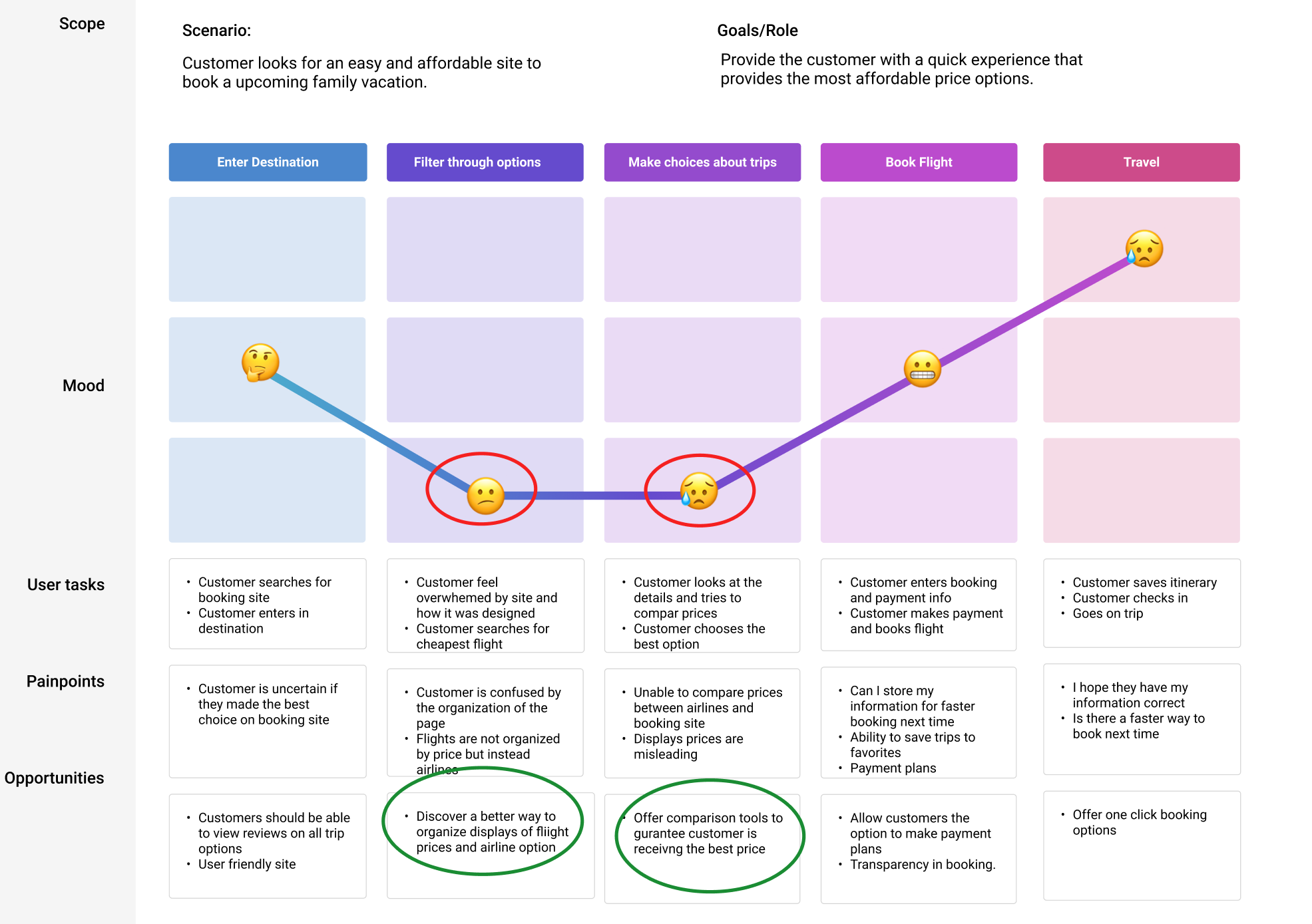
Now that we understand the problem we will map out the current scenario into different phases of the booking process. During this process we will start to understand what our users are thinking and how they are feeling while booking a trip.
User Journey Map
I decided to focus on the user’s journey while booking a flight. In this scenario the user is booking an upcoming family trip and is looking for an easy and affordable way to do so. The journey map highlights the emotional ups and downs that the user experiences while using the app. As you can see through the journey, I was able to uncover some pain point throughout the process.
How Might We…
How might we provide customers with the option to compare flight details?
How might we provide customers with and easier way to filter flight options and pricing?
How might we provide a faster booking experience that is also transparent?
Develop
Feature Prioritization
This is where we organize the potential features of the apps in order to prioritize what the app must have, should have, could have, and wont have.
Value Proposition Canvas
Once we organize the features of the app we will evaluate potential gains and pains from the business side. This canvas shows how the feature will create gains but also review the potential downfalls that may occur during the process.
Jobs To Be Done Framework
“When I am searching for flight/hotel/car options, I want to be able to filter through options quickly so that I can find the best possible solution in the shortest time, which makes the process easier.”
“When I am searching for flight/hotel/car options, I want to be able to compare my options so that I can see what other companies have to offer, that way I know I’m getting the best rates, which makes me feel financially satisfied.”
“When I am completing my booking, I want to be able to complete the process quickly but also understand any terms and conditions, that way I am not surprised by any hidden fees, which makes me feel like the company can be trusted.”
MVP
The compare tool is designed to provide customers with the ability to compare prices with those of our competitors in order to provide them with the most affordable vacations available.
User Flow Chart
Below you will see the happy path that the users will go through when using the feature. The chart begins with entering the website destination up unto closing out the web page.
Deliver
Lo-fi Prototype
The fist step of the process is creating a lo-fidelity prototype that will show the first step in the deliver process.
Mid-fi Prototype
Once I was able to put together the basics of the design I completed the Mid-fi prototype. I was able to create the comparison tool that would allow users to compare prices to those of our competitors and also filter between airlines, time, class and more. During the process I noticed that users were asked to enter their destination twice during the search process. From there I decided to combine both pages together to avoid additional steps in the search process.
Atomic Design Inventory
These are some of the items I created to use in my design.
Hi-fi Prototype
Here are the final results of the Hi-fi prototype.
Success & Failure
This can be measured by churn rates, amount of time spent on tasks, increase or decrease of bookings and app reviews
Outcome & Lessons
Don’t overthink things
Don’t be afraid to ask for help
We’re still learning!
Credits
Ermence Dumesle
UX/UI Designer


